
“My new site is interactive, modern, and fun and most importantly it showcases my portfolio and personality in equal amounts. They delivered both a strong visual identity and a user-friendly, SEO-driven website that sets me apart from my competition.”
-Beth Somers
Food Stylist
Moodboards

Playful Picnic
This fresh, airy direction highlights the playful side of the brand while still reflecting flexibility and precision. Maraschino red and soft pastels bring a bright, playful energy, while deep kale green and milky white add warm, functional contrast. The eclectic, collage-inspired illustration style uses contrast and layering to keep the brand feeling fresh & unexpected.
Baked & Roasted
This rich, vibrant direction feels grounded and modern. Tart reds and deep plum add boldness, while olive, white, and silver bring a fresh, precise balance. The block print illustration style, inspired by linocut and potato prints, adds a relaxed, handmade feel that reinforces the brand’s tactile creativity.

Beth loved both but chose Playful Picnic to guide the rest of this design.
Logo Suite
The logo suite is sauce-inspired, created through many doodles of sriracha (smaller bottle tip worked way better than ketchup) and then heavily cleaned up in illustrator. The Mini Mark is our lovely "B" optically centered within a loose blob of sriracha.
Primary Logo

Mini Mark

Secondary Logo


Typography
BioRhyme is a quirky slab serif with a casual, expressive character that brings personality without competing with the logo.
Archivo Expanded is a wide, structured grotesque that feels sturdy and reliable, balancing playfulness with clarity.
For body copy, Archivo provides a clean, slightly squarish grotesque that adds a sense of technical precision while keeping everything highly readable and grounded.

Color
Bright, expressive tones like cherry, mint, and sky bring energy, warmth, and a sense of play. They are grounded by deeper, more functional hues like nori and salt, which add contrast, clarity, and a sense of balance. Together, the palette feels vibrant without becoming overwhelming, keeping the brand approachable, modern, and easy to navigate.

Illustrations & Patterns
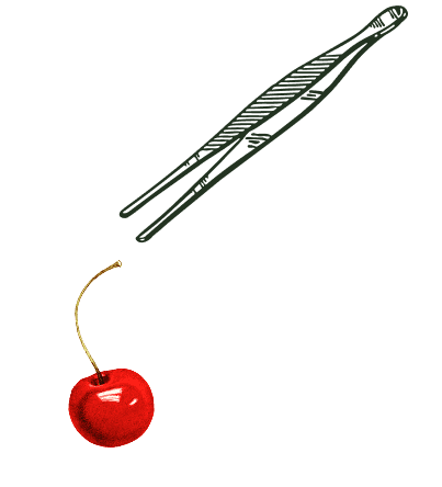
When we dug into what Beth actually does as a food stylist, we learned much of her work is done with precise tools, rather than standard kitchen items. We wanted to simplify the tools with straightforward line work, while emphasizing the adjustments made to the dishes through these collage-style garnishes. These accents work to add creative flourishes without overwhelming the work itself.


This pattern captures the picnic-inspired aesthetic we're aiming for while feeling more elevated and less literal than a traditional gingham.

Photography
We encouraged imagery that felt behind-the-scenes and process-focused rather than overly polished or staged. Moments like sourcing ingredients, setting up food scenes, or casually documenting the styling process as it unfolds.

Web Design
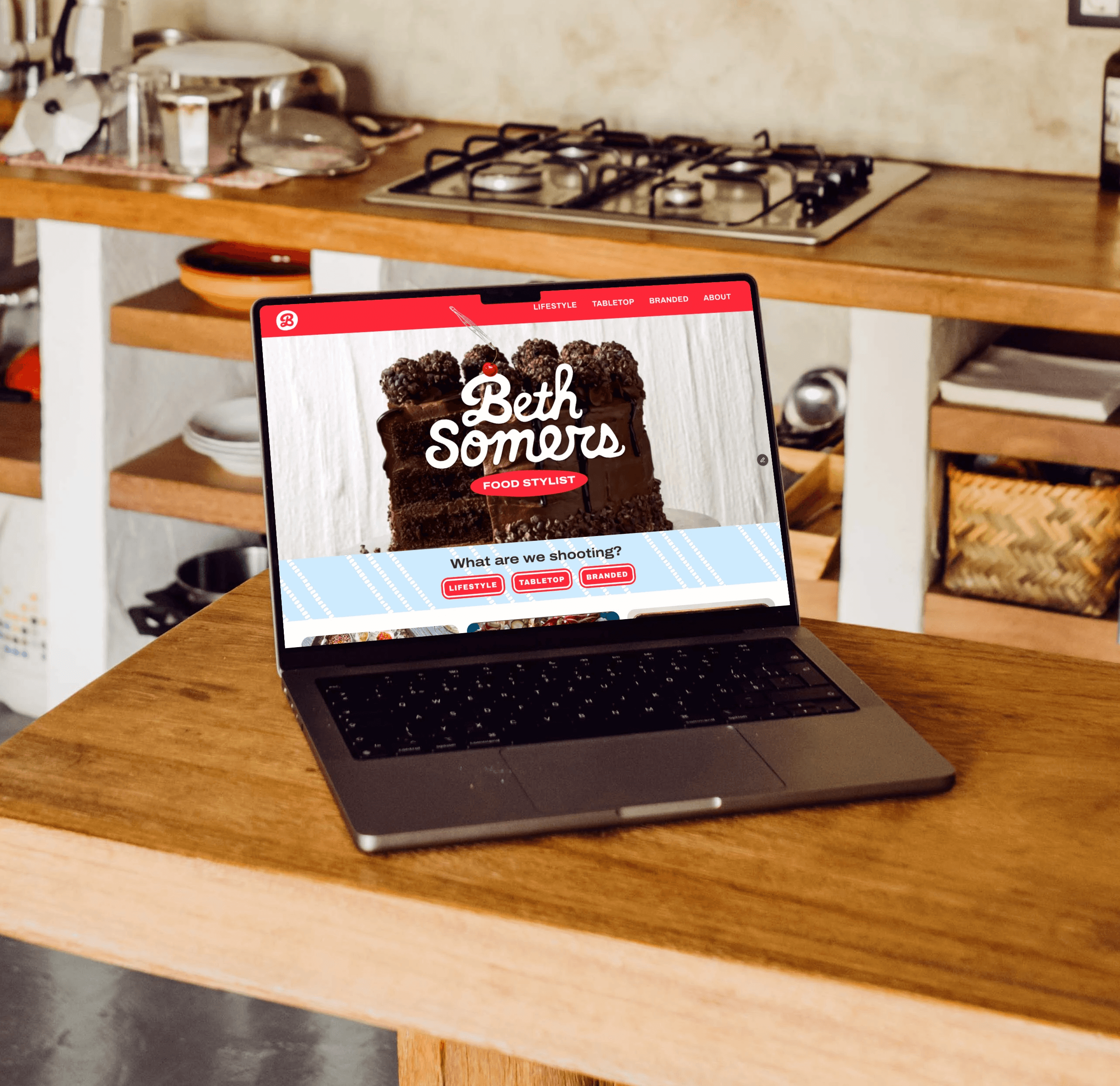
The website was designed to function as both a portfolio and a discovery tool. We focused on creating a clean structure that keeps the work at the center while making it easy for industry partners to understand what type of shoots she specializes in and see a wide range of her work.
Alongside the visual design, we also improved the backend structure of the site to support better discoverability. This included optimizing page structure, adding alt text to all images, and refining how content is organized so the site performs better in search without feeling overly technical.


