


“For anyone looking for a person to work with that will understand their vision, deliver on everything, and provide such a comfortable experience, they shouldn’t look any further!!”
-Sara Faddah
Founder & Co-host of 77 Flavors
Design Direction
77 Flavors needed a brand that could make history feel approachable and engaging while establishing credibility as a growing nonprofit.
The client questionnaire and moodboard exploration revealed a strong connection to early-to-mid 20th century design, drawing inspiration from vintage editorial layouts, geometric typography, and nostalgic color palettes. Two covers from The Chicagoan (top left square on both moodboards) ultimately became the foundation for the directions we explored.

Vibrant Deco
A structured vintage direction inspired by Art Deco typography, editorial illustration, and high contrast warm palettes. It balances geometric type with grounded serif forms to create a more refined, institutional feel.
Jazzy Nostalgia
An eclectic vintage direction that blends nostalgic slab serifs, friendly sans serifs, muted warm tones, and loose hand drawn illustration. It feels expressive, approachable, and culturally rich.

Ultimately, we leaned into Jazzy Nostalgia, but took some typographical elements from Vibrant Deco to balance this friendly color palette with a sharper, Art Deco inspired font.
Logo Suite
Primary Logo
A horizontal wordmark with customized typographic detailing, including staggered numerals and expressive terminals that add movement and personality while maintaining clarity and legibility.


Framed Logo
An oval badge inspired by historic Chicago design artifacts and World’s Fair ephemera, created to support a sense of legacy and future geographic expansion beyond Chicago.
Stacked Logo
A vertical adaptation of the primary wordmark designed for more formal applications, preserving the same typographic character in a more vertical layout.


Mini Mark
A simplified condensed mark designed for small-scale applications, maintaining recognizability while emphasizing texture and brand character at reduced sizes.


Typography
The type system blends expressive display typography with functional editorial type.
TT Modernoir Bold is a jazz-inspired display sans that expresses the brand’s fun & adventurous character.
Filmotype Keynote is a vintage script that shows the brand’s warmth, relatability, and humanity.
Bespoke Serif is a contemporary typeface designed for reading. It gets messages across quickly and has oldstyle numerals.


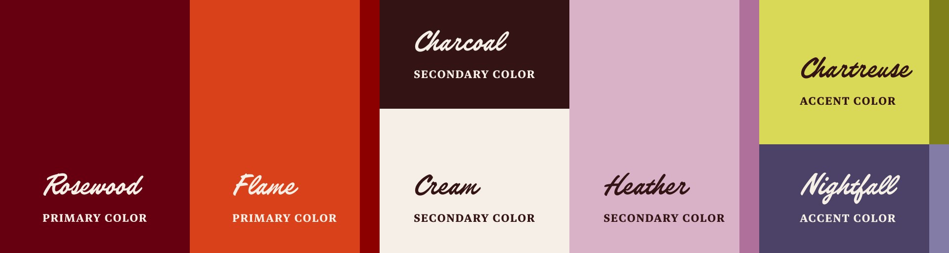
Color
A maximal but structured palette reflects the richness and variety of the brand’s subject matter.
Warm neutrals provide accessibility and ground the palette. Deep red and brown tones reference Chicago’s architecture. Bright accents introduce elements of curiosity and discovery, while secondary hues support illustration, pattern, and system flexibility.
Illustrations & Patterns
Custom illustrations were developed in a hand-drawn engraved style inspired by antique print materials. These elements add texture and historical grounding while reinforcing the exploratory nature of the brand.


Two pattern systems, ornamental Art Deco geometry and brick-based texture, were designed to support flexible application across digital and print contexts.


Photography
The brand photography focused on evoking nostalgia and a tactile, film-like warmth that feels true to this duo. Key references leaned into candid, lived-in compositions like creative work at home and cinematic public spaces such as movie theaters. The final photography brought this direction to life through scenes of researching, filming, and neighborhood discovery. Final photos by Misael Nevarez.
Creative Direction

Final Photography

Web Design
The website acts as the central hub for 77 Flavors, creating a clear, searchable archive for all their wonderful stories.
Structured around a simple user journey from discovery to deeper engagement, the site guides visitors through key touchpoints: a conversion focused Homepage, an approachable About page, a podcast archive with episode notes, and a clear Work With Us page for potential partners.
Built in Webflow, the system uses CMS functionality, fluid type, and scalable design variables to support ongoing content growth. The result is a flexible platform that functions as both a content library and a community facing resource.


Social Media
77 Flavors has grown their audience on social media. They needed a brand that shows up beautifully across social platforms and that has elements they can play and grow with.
A carousel post to announce thier website launch: